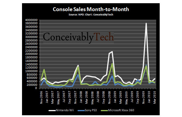
I love charts. We get blasted with videogame sales data repeatedly, but you never get the big picture, especially with console sales data. You always get some kind of spin or complementary comparison that does little to show you overall progress.
This chart from ConceivablyTech does a great job of showing how much each of the top three consoles sold from November 2006 through today, month-to-month. Look at how those holiday spikes keep getting bigger every year. The Wii is the obvious wow, but what goes up must also come down. Also, check out Sony! They’re really getting somewhere now, though it took them years to really get moving, it feels like.
ConceivablyTech’s accompanying text is more of that number blasting I was talking about earlier. If I had to pull one interesting stat out for you, it’s that all three console makers crossed the mark of a combined 60 million consoles sold last month.


Published: Apr 16, 2010 03:20 pm