There is hope
Recommended Videos
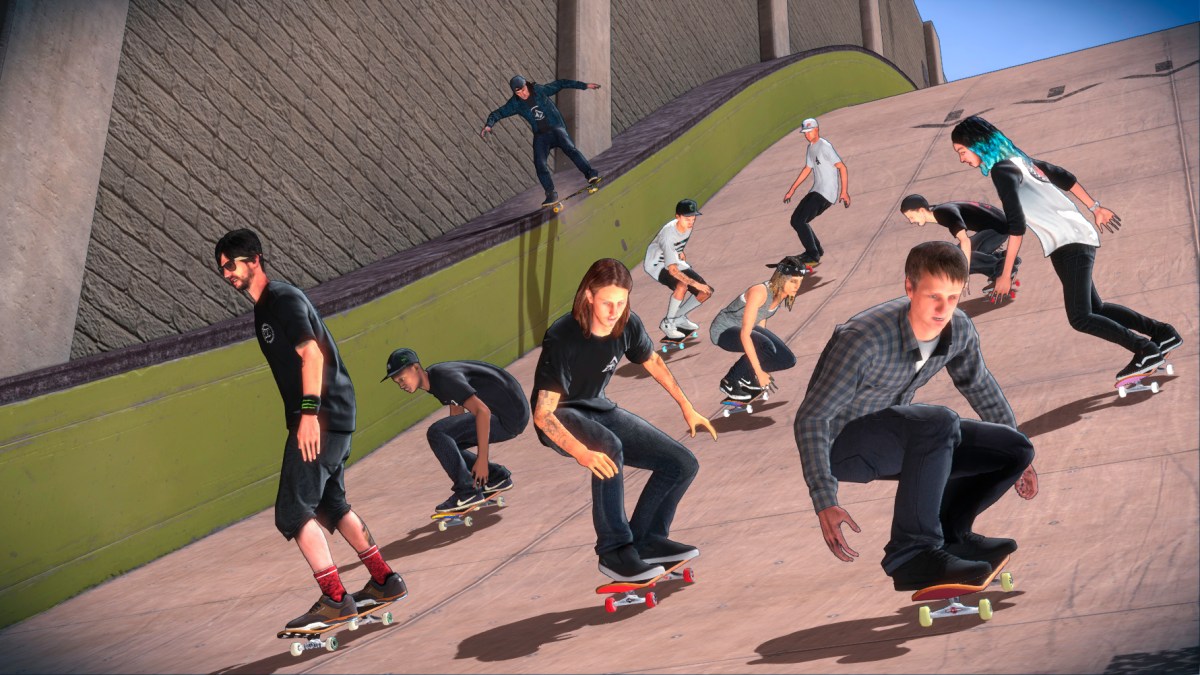
Tony Hawk 5 will be here at the end of September, and developer Robomodo has drastically changed the art style up as of this week. My take? It’s a clear response to the negativity surrounding the original style, which was criticized as generic and drab.
I mean, I’m still interested (not excited), but I’m kind of a Tony Hawk fanatic. If this can recreate the feeling that the original games gave me, I’ll be happy. For comparison’s sake, you can take a look at the old style below, which basically looked like a retooled Tony Hawk HD.
The new style is found in the gallery and in the header.
Here’s a Brand-New Look at ‘Tony Hawk’s Pro Skater 5’ [The Ride Channel]
Old:

New:
Destructoid is supported by our audience. When you purchase through links on our site, we may earn a small affiliate commission. Learn more about our Affiliate Policy


Published: Aug 6, 2015 8:30 PM UTC