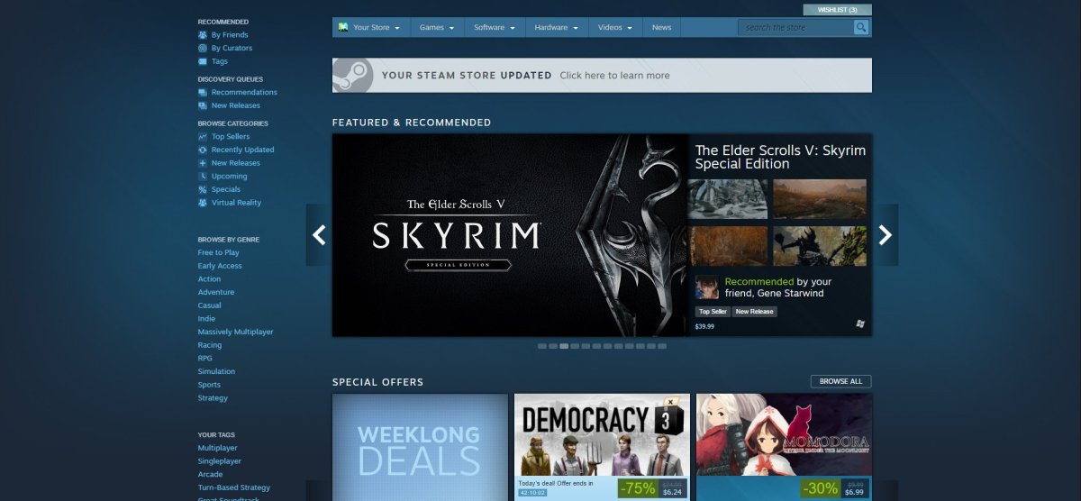
The Discovery Update 2.0 is live
“Keep scrolling for more recommendations.”
I think that sums up the direction Valve has taken the Steam store in recent years. You can manually search for games by name or genre, or peek at the chart-toppers, sure, but have you seen these personalized recommendations? Why, there’s a never-ending list of ’em! Just keep scrolling.
Today’s refresh of the storefront is called the Discovery Update 2.0, so it’s generally more of that same approach to get us to buy games, but some of the layout changes are nice to see. Specifically, there’s a handy “quick access” section on the left-hand side of the store for commonly-clicked pages and topics, and the top-sellers list now shows screenshots (and I do mean screenshots, not concept art).
Valve has an annotated breakdown of the redesign and other recent changes right here. This isn’t a drastic enough rework for me to have strong feelings either way. It’s fine, if a little crowded.
The Discovery Update 2.0 [Steam]


Published: Nov 7, 2016 11:00 PM UTC