Can’t keep its head above water
First-person shooters on the mobile market are pretty hit or miss. When they don’t follow an on-rails scheme, it can be pretty hard to get a solid dual virtual sticks system in place, and before long, users are pining for a real controller.
But The Drowning attempts to “revolutionize” (in the creator’s own words) the mobile market with a brand new control system that isn’t widely implemented yet. My response, after actually playing it, would be: “there’s a reason for that.”

The Drowning (iPad [reviewed on an iPad Mini], iPhone [tested on an iPhone 5])
Developer: Scattered Entertainment
Publisher: DeNA Co., Ltd.
Released: August 1, 2013
MSRP: Free (with microtransactions, Universal)
The Drowning is a level-based post-apocalyptic FPS with minor RPG elements like crafting, upgrading, and equipment customization. Its narrative — conveyed through a series of fairly boring stills and dreary voiceovers — basically amounts to “the world is at its end, and there are zombies in it.” Riveting, I know.
The creators of The Drowning attempt to sell the unique FPS control scheme as “revolutionary.” So, are you ready for the revolution? You tap with two fingers, and whatever is between them is where the bullet goes. Yep — that’s it. You’ll tap a location on screen once to move to that location, tap the bottom to spin 180 degrees, and use the aforementioned two-finger system to shoot.
The reason it doesn’t work all that well is because you can’t really strafe with this approach. As you tap the screen to move across an area, you can hit the 180-spin button to walk backwards and shoot — but the game stops your character, forcing you to spin again, move, spin, shoot, and move again. In the earlier levels, the scheme works great, and almost feels on-rails in nature. But later on, you absolutely need to strafe, and the overly-simplistic layout does not work in its own game.
Hilariously enough, the virtual joystick scheme the game eschews in its advertising is also present — and it works! I was able to easily circle strafe, fall back and shoot, and more. Although you get the occasional misstap, for the most part I was able to accomplish what I wanted. Also, it’s important to note that the game isn’t nearly as playable on an iPhone due to the small amount of screen real estate (especially if you’re using the two-finger shoot scheme), and if you’re going to even attempt to tackle this, it should be on an iPad.
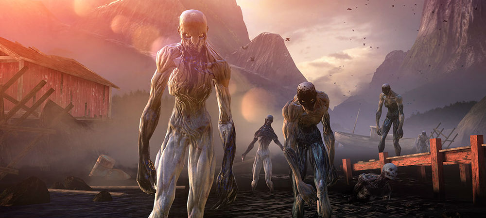
Gameplay-wise, things are very samey, forcing you to engage in the exact same “attack” or “defend” scenarios through each set of levels. The AI is very poor, and can be strafed around at will for the most part without harm. The fact that nearly every enemy in the game looks exactly the same doesn’t help.
The Drowning is a gorgeous-looking game all around however, and it honestly sets a precedent for a graphical baseline in the mobile realm. Even if the actual designs aren’t all that captivating, the environment itself is incredible, and an example of how to create a console-like experience on a smaller device.

But even with some fairly generic enemies and scenery, The Drowning still functions as a decent, stunning mobile shooter. But here is where the game completely falls apart. Microtransactions — and lots of them.
The nefarious wait-walling scheme is three-fold, with energy (called “Gas”) to boot. Firstly, you may find yourself entering a level with 30 seconds on the timer, wasting three precious energy/Gas points almost instantaneously. Then you find out (without warning) that you aren’t equipped with the “right weapon” for the job — which you have to either grind for with random rewards — or buy/upgrade through purchasing “Black/Oil” for real-life cash. Drowning then notifies you that if you buy “Flares,” (after you’ve used up your free allotment of three), you can earn better items in that particular run.
From that point if you’ve exhausted all your energy, then you have to wait to get more gas (read: wait to play the game again). You do start with three gas tank replenishment power-ups, but even then, I was completely tapped out with roughly an hour’s worth of play, waiting for it to slowly fill back up — and you have to buy more from that point on with no freebies. I felt duped on multiple levels, as the game was quite clearly selling me three different ways to pay for a game that should have just been one premium price.

To add insult to injury, there is no option to buy the game outright. It’s a huge shame, as the ability to unlock every weapon and item legitimately through gameplay with no energy mechanic would have been pretty fun, even with virtual joysticks. Did I mention that you have to either login with a Mobage or Facebook account or as a “guest” to even play the game?
In the hands of another developer (Infinity Blade‘s Chair Entertainment or Epic Games, perhaps?), The Drowning would have been something special. Without the energy mechanic and constant drip-fed weapon and item parts, I could easily see myself destroying an entire afternoon blasting apart zombies. But that’s not what happened.


Published: Aug 3, 2013 05:00 pm