Switch Pro?
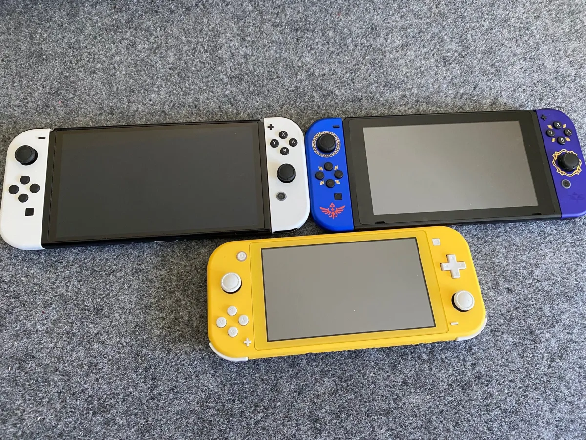
The Switch really came into the industry swinging like a bat out of hell. The Wii U (may it rest in peace) crawled so the Switch could run (for those of you keeping count, this is my 1,000th public eulogy for the Wii U). The new Nintendo system isn’t going anywhere either, with the Switch, Switch Lite, and now the Nintendo Switch OLED extending the lifespan of the four-year-old system. Let’s dive into what makes the OLED…OLED.
(Besides the obvious OLED.)
So we’ve already covered both the Switch and the Switch Lite extensively with their own hardware reviews. You can view the contents of the Switch OLED box above.
This piece will focus on the new aspects of the Switch OLED. We can start with the most exciting part: the dock. Ha! Fooled you.

The dock
So the dock is actually an interesting anomaly in and of itself. It’s very sleek, and with the base OLED model, it comes in white — a nice way to help it stand out if you plan on keeping your old dock (my wife and I dock ours side by side). Instead of using a hinged piece like the previous dock, the new one has a back that is completely removed, then snapped back into place.
It’s nice because the old model was kind of annoying to fish cables into at certain angles with the hinge hanging out, but I did feel like if I applied enough force, I could snap the OLED back (just be careful). After popping it out of the box, I hooked it up with my old AC adapter and HDMI cable, and it booted up just fine.
Here’s what the dock looks like from behind:
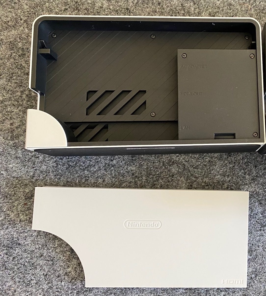
You’ll notice the new LAN port, which is now an official first-party supported feature. When docking the Switch, it automatically swaps to the wired connection, but you can choose to swap it to Wi-Fi in the internet settings menu. Or just not connect a cable at all, of course.
For reference, on non-wired internet (Wi-Fi), right next to my gigabit router (which pulls 900 Mbps actual, wired, on my PC), the Switch clocked a 43.4 Mbps download speed. When connected physically with an ethernet cable to the new dock, the Switch OLED pulled 164.1 Mbps. It’s still not ideal — and your speed mileage may vary — but for my particular setup, it was a clear increase. By comparison, my Xbox Series X, which is the current king of download speeds in my household, pulls 500-600 Mbps regularly with a wired connection.
Something to keep in mind: although it’s not available at the time of publication, Nintendo has stated that it intends to sell the OLED dock separately, which will work on older models. Keep an eye out for it if you aren’t getting the new Switch OLED.
The screen
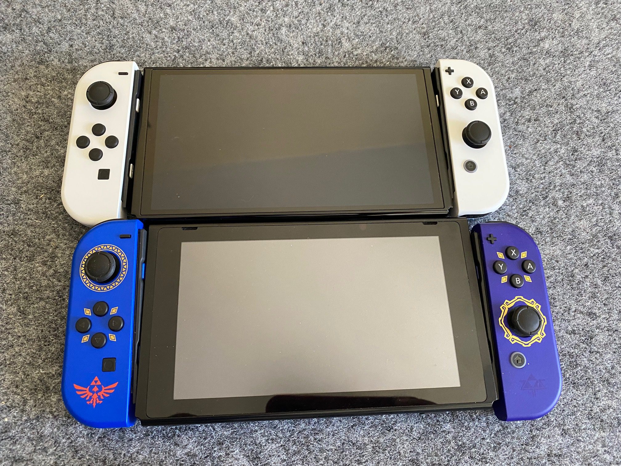
Arguably the biggest event of the Switch OLED is the actual [glass] screen, which makes portable gaming pop more and, in theory, should be more resilient to wear and tear. Not only is it more vibrant due to the different tech, but the OLED is 7 inches, compared to the 6.2″ on the original Switch. It doesn’t sound like much, but when combined with the brighter presentation, it is. Just remember that it’s still 720p.
After experiencing the Vita OLED (I never packed that bad boy up, it’s still on my nightstand), it was really hard to go back to anything else in the handheld gaming world. During this test period I was able to play Metroid Dread: a brand new 4.1GB first-party game that’s full of color, and you could say Nintendo planned for this with the dual-release strategy.
The new screen looks good. $350 good? Maybe not for a lot of you out there, especially since the OLED’s main selling point needs to be used in portable mode to be appreciated.
One of the most alluring elements of the OLED was using it with first-party games, where everything just looks so much better as a result. Anything bright and colorful is going to look fantastic, Metroid Dread included. But it also is able to better display darker tones, especially retro-style games that go for a more minimal aesthetic. Minit and Gato Roboto are prime examples, as their styles are much more noticeable on the OLED across the entire color spectrum.
Oh, and it still fits inside of the Flip Grip, even if it’s snug. The OLED unit size specs are: 102 x 242 x 13.9 mm, weighing in at 320 grams without Joy-Con and 420 grams with Joy-Con attached. The original Switch clocks in at 102 x 239 x 13.9 mm, weighing 297 grams without Joy-Con 398 and grams with Joy-Con attached. As you can see, it’s very close, since the screen was enlarged within existing real estate. Not all accessories may work if they’re based on perfect-fit dimensions for the prior model.
As a reminder, the Switch natively has a burn-in-reduction feature in the TV settings portion of the main menu.
The unit
Now onto everything else and the odds and ends.
The OLED Switch has a low-key upgrade of 64GB of internal storage, up from 32GB. Upon booting it up and installing my first system update, I discovered that it’s 54.9GB of usable space. Whoa, how generous!
I kid, I kid. While 32GB is exceedingly low for the base Switch, over the course of the last four years, I’ve had far fewer issues with space compared to say, the PS5, which is my current living nightmare. MicroSD cards are constantly on sale, and upgrading/transferring data to new models takes around 15 minutes. An extra 32GB is three or four big first-party games, or a ton of indies. Depending on how you use your Switch, it could be substantial, especially if you’re coming into the ecosystem for the first time.
Another little-but-kinda-big glow up is the new kickstand:
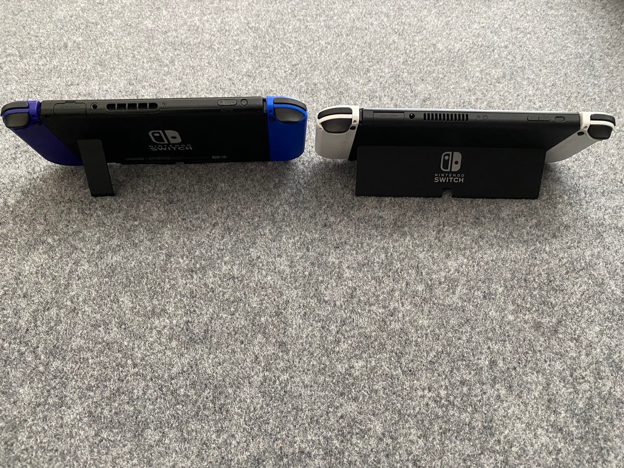
The original Switch had a woefully poor stand that did not adequately sell the promise of “tabletop mode.” For years that mode of play has been my least favorite by far, but I might end up coming around to it with the Nintendo Switch OLED. It’s annoying that this should have been part of the base model in the first place, but the nearly full-width kickstand actually feels sturdy and worth using.
No joke, the few times I’ve used tabletop mode with the base model have scared me, as it slammed on the table several times after the kickstand slipped. Somehow, in a cruel twist of fate, the original Switch even fell while setting up this picture. The Switch OLED was as solid as a rock, and when pulling out the stand, the hinge feels deliberate and firm. The MicroSD slot is still under the kickstand (to the left).
I’ll also lump the “enhanced audio” in here. It’s a blink-and-you’ll-miss-it bullet point, but the Switch OLED does sound a little better with its onboard speakers. While a lot of people are going to be using their own setups with TV mode and/or headphones (Bluetooth!), this marginal upgrade is appreciated.
It really sums up the Nintendo Switch OLED situation in general. So is it the “Switch Pro?” No. That was obvious when the Switch OLED was announced, and Nintendo has not tried to hide that. For $350, the new model asks a lot out of existing owners. But it’s also a great entry point, and if you predominately play in portable mode (or in tabletop), it could be a nice upgrade.
[This review is based on hardware provided by the manufacturer.]





Published: Oct 8, 2021 04:30 pm