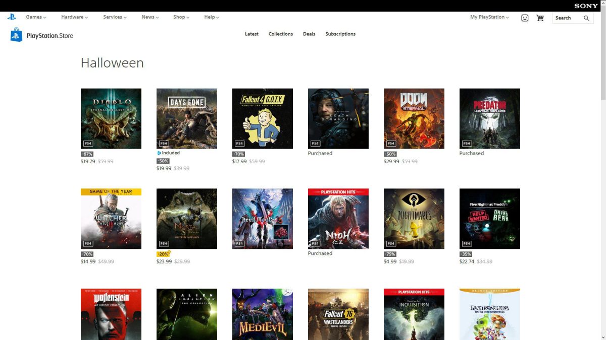
It’s minimalist to a fault right now with missing features
Sony has been rolling out the redesigned PlayStation Store for web browsers this week on a regional basis, and earlier today, the changeover happened in the United States. So far, it’s a vastly different-looking site – and the functionality we’ve gotten used to over many years hasn’t carried over beat for beat. The new storefront is an upgrade in some ways and an undeniable downgrade in others.
This is going to be a big adjustment, that’s for sure. Nothing is quite where you want it to be.
Whether you’re looking at your PlayStation library and remotely queuing PS4 downloads, checking your trophy progress, or scanning for deals, everything is flashier (and sometimes faster) but not necessarily more functional from a usability standpoint. That’s to say nothing of growing pains like a lack of search filters and wishlists, and the complete removal of legacy listings for PS3, PSP, and PS Vita games.
My biggest hangup so far? Not having individual game titles written out with plain text.
Say you want to find a specific DLC pack for a game with tons of add-ons – or hell, say you’re simply looking at any video game in any sale, period. In either case, all you’re going to see for each listing is game artwork that may or may not clue you in with a clear, easily discernible logo. It’s a UX mess.
I have a feeling Sony will tidy things up sooner than later and we’ll also see some of these missing features return in time for the PlayStation 5 launch. As it stands, the store feels weirdly unfinished.


Published: Oct 22, 2020 8:00 PM UTC