I’d surf this
The Switch UI has been surprisingly dormant since it was released.
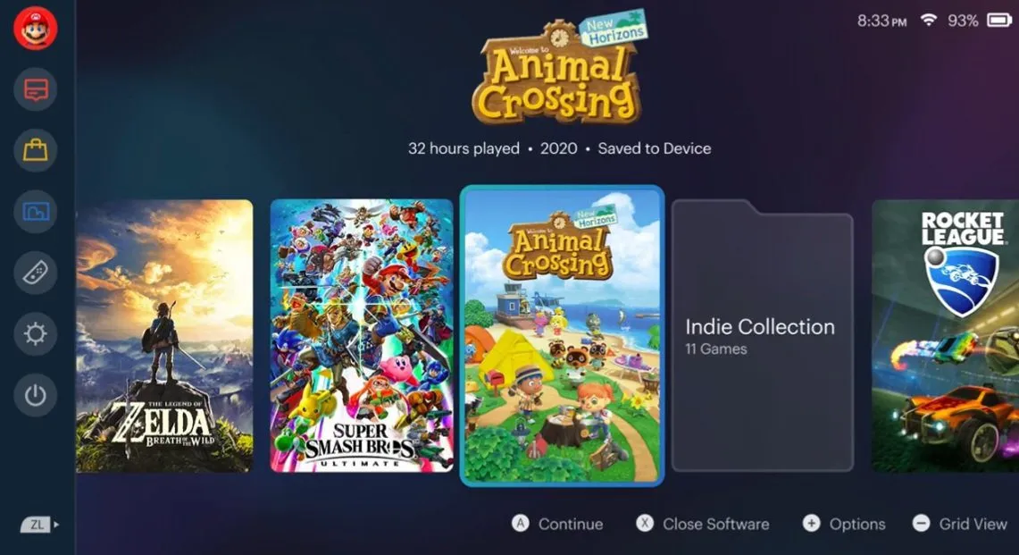
While it gets the job done in some respects, it lacks a lot of modern features like folders and other perks. Plus, the menu sound design is a huge downgrade compared to the Wii and Wii U. So every few months someone takes it upon themselves to upgrade the UI with a fan mockup: and I have to say, pretty much all of them are on point.
Take this one from Redditor Frieznburg. It’s still elegant and clean, like the current official UI, but it allows users to add games to folders that look uniform with the other game icons. What I really like about it is that it showcases the “hours played” data right there on the main page when you highlight a game, as well as the release date. For reference, they used Figma to craft all this.
This isn’t as drastic as some other redesigns, so I suspect that a lot of folks are going to be down with it. One common complaint when it comes to fan mockups is that they’re “too busy or superfluous,” and to some extent, I do agree that the official setup does look great when juxtaposed to the somewhat messy PS5 OS, or the Xbox interface.
But still, there is a way to add both functionality and flair to the Switch UI, and I’m eagerly awaiting the day that Nintendo actually implements some of these features.
Switch Home Redesign (Fan-Made) [Reddit]


Published: Apr 26, 2021 09:00 am