Dreams and Madness
Just two months ago, DmC: Devil May Cry was released and caused quite a ruckus. While this unique entry in the Devil May Cry franchise didn’t exactly light up the charts, and remains a contentious title with series fans, at the very least it’s difficult to not admire the detail and creativeness with the art direction.
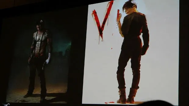
At GDC, Ninja Theory’s Art Director, Alessandro Taini, spoke at a panel about the challenges of creating a new visual style for this reboot, and of course the many different designs they had to go through to nail Dante’s look.

When Capcom first approached Ninja Theory for rebooting Devil May Cry, one of the ways they pitched them the project was asking them to, as Taini put it, “Imagine Dante as he was in a western movie.” At first they produced concepts that were different, but still familiar with previous games — but as Capcom wanted a new and unique take on the brand, Ninja Theory took a more creative approach.
Many of their initial designs saw inspiration from many popular films and television series’, such as Fight Club, Perfume: The Story of A Murderer, and Showtime’s Dexter. Ninja Theory created dozens of unique concept and design sketches for Dante, many of which were never shown until now (and some of which can’t be posted here).

As with many other characters from past Ninja Theory games, such as Monkey from Enslaved and Nariko from Heavenly Sword, the look of the character defines them as much as their personality. Taini and the developers at Ninja Theory wanted the design of Dante to not only have a story to tell, but also be a necessary component of understanding who he is. “The look of the character is the key to understanding the origins of Dante, and to show what kind of world he lives in,” explained Taini, while showing different slides of Dante’s design evolution.
While this was a more contemporary take on Devil May Cry, much of DmC‘s art style was inspired by surrealist and renaissance era artwork, and was later appropriated to the game and given a more modern flair. In particular, the works of Michelangelo Caravaggio was a profound influence on Taini and the tonal direction that Ninja Theory took for DmC.

In terms of actual environments, Ninja Theory originally had different plans in mind. When researching the previous games, they noticed that environments were always lifeless and made Dante look relatively small in comparison. Their original plan was to incorporate crowds of NPC characters to populate the demonic environments, a la Assassin’s Creed. While they didn’t elaborate on what they proposed to do with them exactly, they did say Capcom producers quickly shot down the idea in fear of it sucking up too many resources.
Fortunately, this led to the creation of the ‘Malice’ aspect of DmC. Wherein the environments are this shape shifting and malevolent force that stalks the player. As with the developer’s penchant for character detail, this gave the ‘Malice’ a character of its own. This also allowed Ninja Theory to create a middle ground between their ideas for contextual and interactive environments, and the massive and looming architecture of the previous DMC games.
To close out their presentation, Taini replayed the “3 Years in 3 Minutes” video, that played over the ending credits of DmC: Devil May Cry. The video showcased many of NT’s animatics, storyboards, and prototypes for their early concept pieces. The evolution of DmC Dante’s design was a long and trying road, and hearing Tim Phillipps towards the end up the video montage throw out his catch phrase, “My name is Dante” was great way to end the panel.


Published: Mar 29, 2013 4:00 PM UTC