Nintendo just published chapter 2 of it’s “Ask the Developer” column with members of Acquire’s team who worked in Mario & Luigi: Brothership. This time around, they talked about the visual identity of this RPG and ended up revealing some fascinating tidbits about its development.
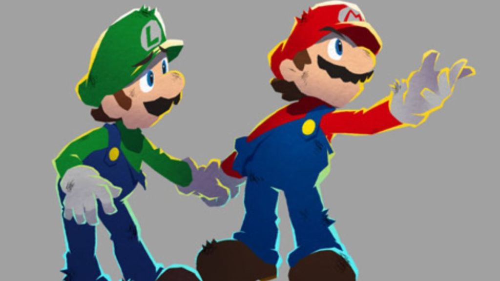
Hitomi Furuta, one of the game’s designers, confirmed that developing 3D visuals for Mario & Luigi: Brothership was a challenge and that Acquire was searching for a new Mario & Luigi style. “At one point we ended up trying to present an edgier, more rugged Mario instead. Then we received feedback from Nintendo that we should aim to make the art direction identifiable by fans as belonging to the Mario & Luigi series,” said Furuta.

This revelation was accompanied by new concept art of Mario and Luigi during this “rugged” and “edgier” phase. While I can see why Nintendo preferred Acquire to go in a more traditional direction with its art style, I can’t deny that these character designs look amazing, especially Mario with his long yellow cape, which makes him look like a seasoned superhero.
Akira Otani, a Nintendo employee who acted as a co-producer of the game, added that his company saw these character designs as “something different that just resembled Mario”, and called for a meeting as a result. “During the meeting, Nintendo showed us a document describing what defines Mario and Luigi in the Mario & Luigi series,” said Furuta. “So, when we got that clear direction from Nintendo, it made perfect sense to us. I think that’s when we realized for the first time: “Ah, this is what we should be aiming for this time in terms of a 3D visual style from Acquire”, and were able to establish the fundamental direction.”
Nintendo helped Acquire find its own Mario & Luigi art style

Mario & Luigi: Brothership director Haruyuki Ohashi mentioned that they had a strong desire to experiment with new visual styles but that Nintendo articulated its vision to them in a way that they found convincing. He also added, “Acquire has hardly ever created games with other companies’ characters, so we didn’t have an established process for this,” which is 100% correct. After all, this studio is famous for franchises like Tenchu or Octopath Traveler, and its developers very rarely have to use IPs that belong to other companies. But they were obviously not going to miss their chance to develop a game in the Mario series.
None of this really surprises us, because Nintendo is a company that often likes to take risks, but it’s also known for having strict guidelines for the ways its character are designed and implemented into other games, especially those that it assigns third-party studios to develop.
The Mario series has featured a large and diverse array of art styles throughout the years, but none of them were really as edgy as what Acquire was suggesting, and it would have ultimately looked out-of-place in a title as colorful and light-hearted as Mario & Luigi: Brothership.
Many other visual aspects changed drastically during development

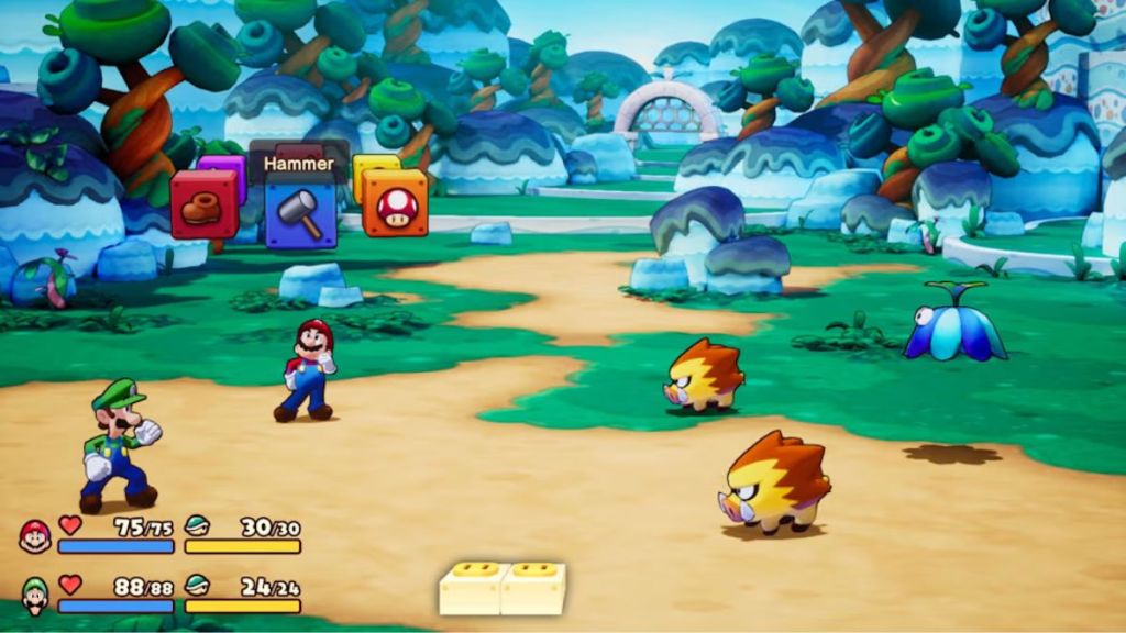
Furuta also mentioned how the designers struggled to match the expressiveness of Mario and Luigi in their original 2D sprites with their new 3D models. This makes a lot of sense, seeing as this is the first entry in the Mario & Luigi series to be fully made with 3D graphics and environments from the ground up. The talented team of designers (and Nintendo’s assistance) Acquire made it work, as Brothership looks colorful, cartoony and extremely appealing. It perfectly translated the series’ signature art style into a 3D world.
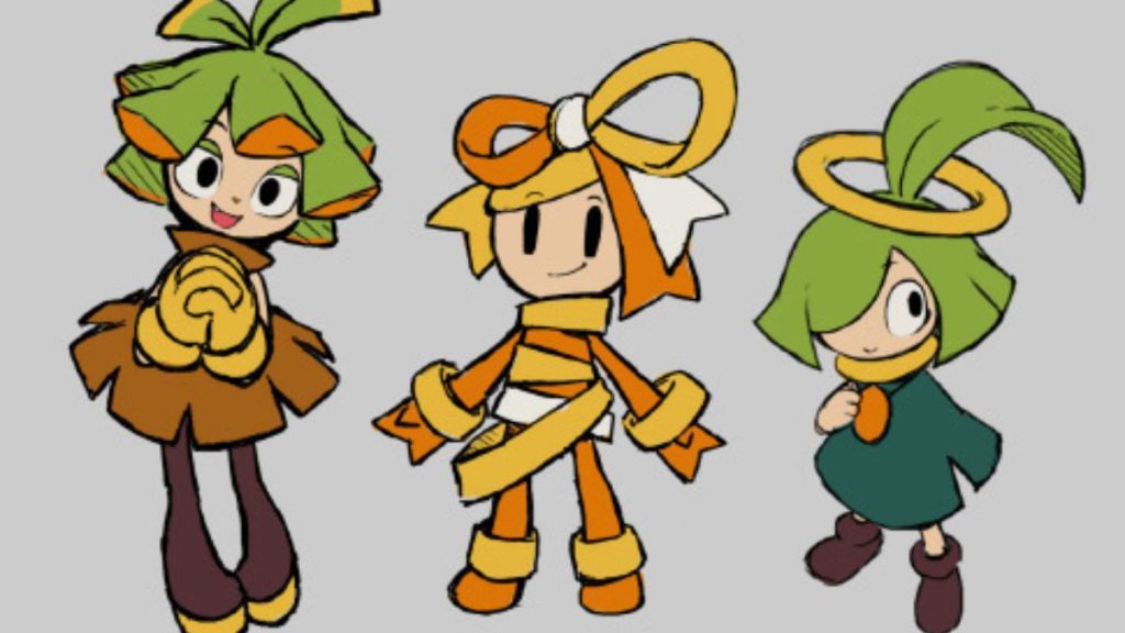
Lastly, Furuta revealed how some of the brand-new characters they created changed drastically during development and provided some concept art as proof. The new supporting character, Connie, was originally going to look more like a human, changed into an anthropomorphic being with yellow ribbons all over her body, but ultimately became a Wattanist, with a unique electrical outlet and plug theme on her design.
On the other hand, Connie’s good friend, Snoutlet, also looked quite different since he was originally going to have eyes on top of his head, but the designers changed it so he just has his eyebrows on that part of his body because, according to Furuta, “It’s fun to guess where the real eyes are.” Even though unused concepts were promising, the final versions of all these characters look better and fit perfectly into the world of the game.


Published: Dec 4, 2024 02:28 pm