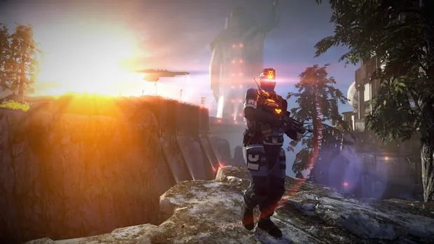
Graphics thralls, unite and be delighted!
The Killzone series has always pushed graphical horsepower as one of its biggest selling points, and it’s hard not to get excited at all the pretty lights and motion blur. As such, gorgeous gif images tend to crop up whenever a new game is in the works, and Killzone: Shadow Fall is no exception.
These images, taken from Revision3‘s preview footage and cultivated by Gamepur, showcase the gorgeous visuals in the upcoming PS4 launch title. Yes, there are lovely lighting effects, and the animations are indeed beautiful to behold. However, I’m firmly of the opinion that art direction trumps raw graphical power any day of the week.
Shadow Fall seems to deliver in that regard, combining power with actual artistic talent. You don’t see too much of that in the so-called “AAA” sphere.
For me, it’s the strong, contrasting architecture of the Helghan and Vektan environments, as well as the bold color schemes, that get me off. It takes money to make a game look pretty — it takes skill to make a game look truly stunning. All that cash means nothing if you can’t do anything definitive with it.
This is where Shadow Fall succeeds, at least looking at these images. Check ’em out below, but be aware there’s a ton of moving pictures down there!


Published: Oct 24, 2013 11:45 am