Bad medicine
I’m sulking. I’m sulking because apparently some folk have received their The Art of Overwatch tomes already and I’m sitting here with no Art of Overwatch tome (which releases next week). Regardless, lucky owners are already sharing pics of some of the concept art for the arena-shooter’s lovable roster of heroes and reprobates.
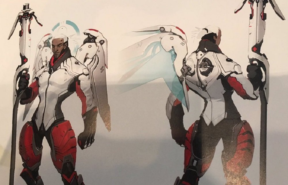
But, among the test-sketches of stages, poster art and everyone’s favourite loot box item, sprays, a portion of the Overwatch community is falling over itself at some Mercy concept art that depicts the angelic healer as a buff-as-hell (heaven?) dude, posted on twitter by user
Pumpkin Spice Enema.
how can i live a normal life when i know this concept mercy exists pic.twitter.com/E91lTn8AZb
— pumpkin spice enema (@kenhinaiscanon) October 15, 2017
Concept Mercy features a very similar design in terms of costume and colour, but is now sporting a figure that looks like he spends as much time pumping iron as he does pumping IVs. This design has already led to numerous pieces of cute fan-art on social media.
A decision was made during Overwatch’s development that classes should be instantly recognisable by shape. This is why, generally, Tanks are big squares, DPS are athletic humans and Support are thin pencils. Concept Mercy looks badass enough to be almost all three of those, so I guess his design was passed over.
That’s fine for me, because although I do think he looks cool-as-hell, I’m a Mercy player and I love Angela’s design. I think her slight, quiet appearance, provides some much needed “calm” to the game’s colourful, loud and large-than-life roster.
The Art of Overwatch is released on October 24.
Overwatch fans love Mercy concept art [Heroes Never Die]


Published: Oct 17, 2017 12:30 pm