You listening, Sony?
Recommended Videos
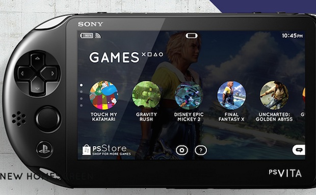
Behance designer Rafał Czaniecki has created a beautiful user interface concept for the PlayStation Vita. It’s so nice that I wish it could be implemented somehow.
Sony likes horizontal bars, right? Czaniecki’s design uses one as well, letting users flip through their game collection, social apps, and other menus like you might in any media bar. A pinch/zoom lets you pan back and see more games at once, and then collapse them when you’re done looking. I love it all, from the new game screens to the simplified icons.
Don’t get me wrong; I dig the current Vita interface, and it has definitely improved since launch. But this concept is so elegant!
What do you think?
Destructoid is supported by our audience. When you purchase through links on our site, we may earn a small affiliate commission. Learn more about our Affiliate Policy


Published: Apr 7, 2014 08:30 pm