Starting today, Gamerscoreblog will be posting a weekly feature centered around the “New Xbox Experience” a.k.a. what using your Xbox 360 will look like once the Fall Dashboard Update drops.
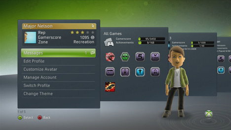
In this first installment, the new look of the Gamercard is examined. As you can see in the snapshot above, all of the primary features currently accessible from your Gamercard are still there, only now they’re going to be easier to find.
After glancing up at the header image a second time, you’ll notice a bunch of cards to the right of the Gamercard. The first card details your Gamerscore and the highest possible score you can achieve based on your game collection, while each card after that represents a game you’ve played.
So, anyone feel passionately about the New Xbox Experience one way or the other? I’m personally excited for the changes in organization and layout more than anything else.







Published: Sep 12, 2008 8:23 PM UTC