Vote or die
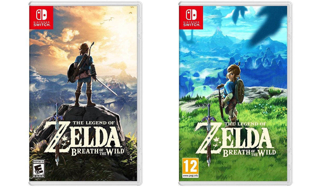
There are two competing box arts for The Legend of Zelda: Breath of the Wild. We’ve got the North American version, which is the same one Japan will use, surprisingly:

And then there’s the softer, more saturated and painterly European box art:

I’m not really into either (box art is just so dull these days…), but if my adjectives didn’t tip it, I’ll probably take the brighter one that shows off the main character. The American/Japanese one follows way too closely the trend of staring at someone’s back to convey some serious meaning (see: Dark Souls 2 et al).
Mostly I’m surprised Japan is going that way, given the typical discrepancies between Japanese and American box art exemplified by Angry American Kirby.


