I wasn’t expecting Turok 3: Shadow of Oblivion to be remastered. While Nightdive Studios updated and rereleased the PC versions of the first two games, there wasn’t a PC version of Turok 3. They didn’t have the source files, so they had to reverse-engineer the N64 version and port it over to their proprietary KEX Engine.
It’s a lot of work to go through, especially when Turok 3: Shadow of Oblivion is hardly the best game in the series. To put it charitably, it’s mediocre. Neither liquid nor solid. Remastering it was hardly going to be a financial home run.
But, as I said in my review, “It wasn’t the smart thing to do. It was the right thing to do.” The remastered N64 trilogy of Turok games (excluding Rage Wars) would remain incomplete without that last game. For historical context, it needed to be there. The journey needed a conclusion.
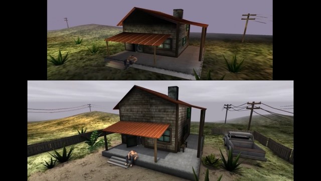
So, Nightdive went all in on the remaster and then didn’t stop there. Beyond just getting it working on PC, they gave it a loving touch-up, buffing that carp until its scales sparkled. But it’s so true to the original that it can be easy to miss. Albert Marin Garau, a member of the art team at Nightdive, put together this comparison between the remaster and the N64 version (via emulation) to show off exactly how much of an upgrade it really is.
By the way, there are massive spoilers in the video.
“I think we’ve reached a good balance. The fans who haven’t played this title for a while won’t notice that there has been a radical change in the game’s assets, other than the sharper look. But after a few minutes of playing, they’ll certainly notice that there is something more than a simple skin lifting…” Albert told me via email. “At the same time, the visual part of the game will not be visually offensive to new players, whom the original textures and models could be such a negative aspect that it could ruin the experience at a certain degree.”
“The game still looks ‘retro,’ though. But that’s not a bad thing, on the contrary.”
Nightdive did a similar thing with their remasters of the Quake games. All the models there were touched up to add more detail. However, if you were separated from the games for any length of time, you might not even notice. Only under direct comparison do the differences become clear.
Even if you do notice the difference, it still doesn’t look like a modern game. To me, I could believe that this was a PC or Dreamcast port that followed the N64 version, sort of like the versions of Shadow Man.

The textures were the most impressive part for me. The lighting feels like a given just because it’s in a more modern engine. As Albert explains, the KEX Engine “allowed us to add, move, adjust and tweak almost every single light source, and even use those beautiful real-time lights that cast shadows.”
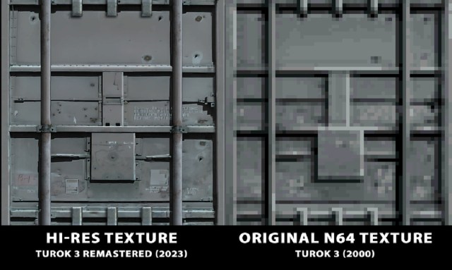
On the other hand, the N64 was awful to textures. The console only had a 4KB texture cache, which is unimpressive, to say the least. Reverse-engineering the N64 version means that they’d wind up with all the tiny, low-detail textures stored on a cartridge. This would look awful running in modern resolutions.
However, many of the textures were pulled from texture libraries, some of which they were able to find with the help of their “texture archeologist.” But they had to replace every single texture in the game, and not all of them could be found. Even some of the ones that could be found weren’t of the necessary quality, so they had to be touched up by hand, while others needed to be remade from scratch.
According to Albert, “The most difficult part was to identify what’s what. When you have thousands of 32×32 textures, it’s really hard to tell what kind of surface are we looking at. So, the context was really important. It was easy to mix up what’s stone or rusted metal, or even a monster shell at these low resolutions!”

But the team didn’t stop there. They also went further to upgrade each of the models without compromising the game’s original art direction. Albert pointed out, “A good example of what’s been done in the character models can be found in their hands… now they have normal 5-finger hands! We’ve added extra detail to the most blocky parts of the character and enemies’ bodies. Some monster’s model simplicity made it hard to tell what we were looking at. We added extra detail and/or fixed inaccuracies to every stage model and added extra props to the more lifeless areas of the game.”
This can easily be seen around the house in the opening cutscene. In the N64 version, the muddy and low-quality textures make it look like it’s just sitting in an empty field. A later shot, however, indicates it flanks a road and is part of a neighborhood. The upgrades Nightdive did do a much better job of selling that fact. They didn’t remove the foggy surroundings, so it still has that N64 edge.
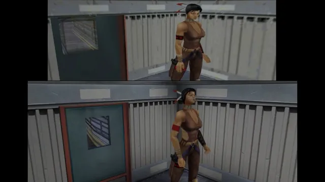
I found it somewhat hilarious, however, that Turok 3 had so much trouble with the scale of some models. A shotgun lying next to a corpse in the first level, for example, is often absurdly larger than the person who was supposedly holding it. At the 8:23 mark in the video, it shows Danielle on a train standing next to a door. In the N64 version, the window is askew, while Danielle towers over the threshold. Nightdive fixed the window but left the massive Danielle, preserving the scene’s absurd look while fixing the details.
Even upgrading the models like they did was a challenge. Albert recounts, “The model format used in this game had some limitations of those years regarding how the bones of the skinned meshes work. This drove us crazy at some point when adding some extra detail in the 3D mesh here and there broke the animations.”

“I really put a lot of love into the facial animations. I wanted to inject life into the characters,” Albert told me.
If there’s one place that Turok 3 was exceptional at the time, it was with the facial animations. Having lip-syncing was extremely rare, and having expressive characters was even less common. The only other game that I can readily name off the top of my head with this level of detail is Conker’s Bad Fur Day. The console just wasn’t built for it. Even then, Turok 3 wasn’t always great at it.
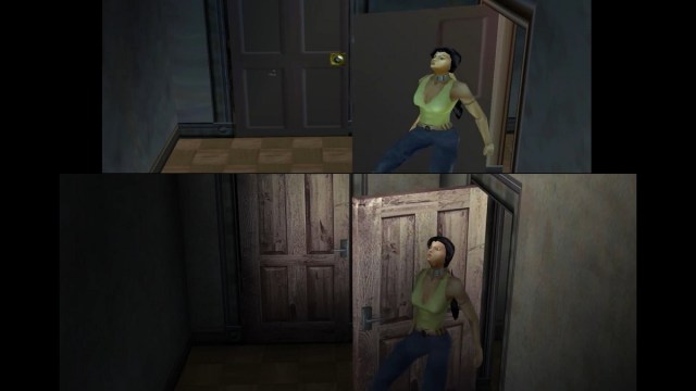
So Nightdive took the opportunity to expand on this feature. As Albert explains, “As you can see, in the original, only a few facial animations make sense. The reason is they used 2 different models for every character: The ‘upper body’ and more detailed face and the ‘complete body’ with simplified face model. They used the first one for close-distance camera angles which mouth movements were pretty accurate, then we have… the rest of the animations using the simplified face model. There were some animations that were used in more than one moment and in different cutscenes with random and generic mouth animations, or simply with no facial animation at all…”
You can really see this whenever a character talks with their full body showing. Look at 3:57 in the video. Danielle comes out of her room, fully dressed for some reason, to check on Joshua Fireseed. In the original N64 version, Danielle has no really visible facial movement, while Joseph has very little. However, in the updated version, she’s actually able to move her mouth and emote.
“For the remaster, I created unique animations for every camera angle with custom facial expressions and lip-synced mouth animations,” Albert told me. “It was mostly a frame-by-frame work, but I really enjoyed doing it!”
The animations, in general, were a nightmare to work with. Albert clarified, “The model format limitations forced me to adjust almost every single animation for the characters and enemies, but we also took the opportunity to improve them (no need to mention the originals were far from being polished) and even add extra animations that were nonexistent, lame or even a few unused animations the original developers removed for some reason.”

This video demonstrates why retro games are in good hands when they’re given to Nightdive Studios. The Turok 3: Shadow of Oblivion remaster still looks like Turok 3, maybe just cranked up to its maximum settings. It doesn’t look like a new game built on the bones of an older one, nor does it bear the blasphemous inconsistencies of a (typical) fan-made HD mod. It’s also not some sort of officially stamped abomination like the Silent Hill HD collection. Changing too much robs a game of its original intent and its historical context. Not changing anything risks alienating new players. They didn’t “fix” Turok 3. They just spit on a napkin and wiped the marinara off its face.
As Larry Kuperman, Director of Business Development at Nightdive, once said to me, “If someone is looking for the latest Unreal 5 game, they probably didn’t want Turok.”
It’s not even an argument of “Don’t fix what isn’t broke.” It’s more like, “Don’t assume you know better than the original developers.” And yet, actually trying to stay true to the developer’s vision while breaking away from the technological constraints of the original release takes a lot of work. In fact, I’d argue it’s more difficult. The fact that Nightdive will take the more difficult path, even for a game of questionable quality like Turok 3, demonstrates a reverence for the medium as an art. And that feels like something that there has always been a lack of when it comes to video games.


Published: Dec 12, 2023 10:00 am