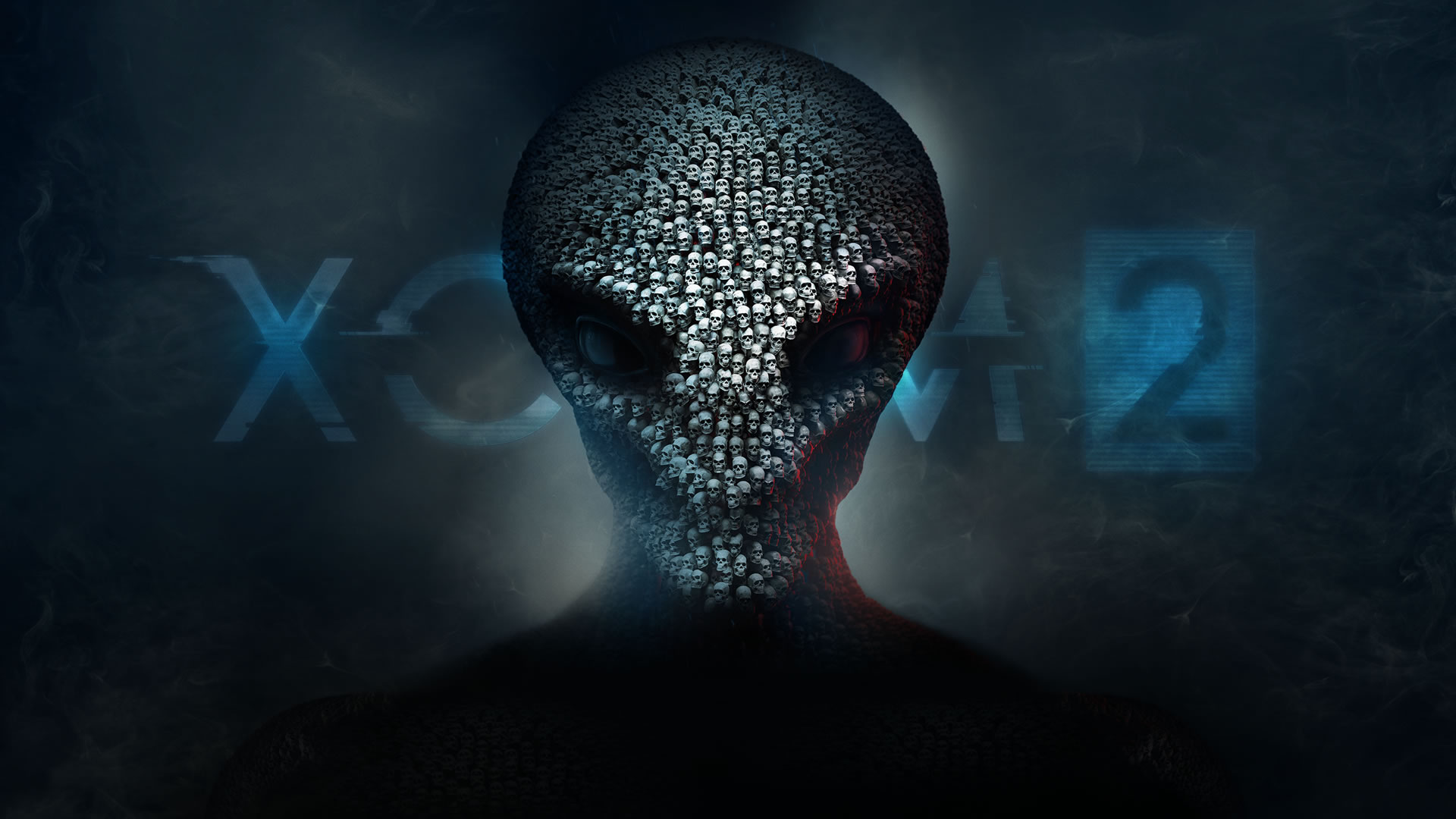
Good luck, Commander
While I would sell out any one of you reading right now to have spent the last week or two playing XCOM 2, our review copy must have been lost in the mail. It’s out, probably dope as hell, and my guy Nic is on it working on the review.
And so it’s been a while since we’ve talked about box art. I believe last time we came to the conclusion that only Japanese developers have a Hasbro’s Clue® what the H-E-double-candlesticks-in-the-conservatory they’re doing when it comes to box art. Just look at this Hot Package.
On the other hand, look at Bethesda’s new Doom game. What’s this baloney? At least it’s closer to a popping yellow than brown and the “DOOM” typeface is cool, but, uh, look at this fucking Revenant art you could be using instead. The current Doom box art is smug, confident, “I can handle that, no biggie” space marine. That Revenant art has fucking neon laser beam Mountain Dew eyes, flaming jetpacks and screams ARE YOU READY TO PLAY SOME FUCKING DOOM!?!?!? while kicking you out of an airplane, into hell, armed with only a shotgun to break your fall.
Look at those lightning Ecto-Cooler eyes and roaring, salivating mouth; this fucking breakneck skeleton has just cummed the best cum of his life and he’s ready to FUCK. YOUR. SHIT. UP. It is adrenaline ground up with tree pulp and Four Loko and pressed onto paper. Or it should’ve been, if fucking assholes weren’t in charge of everything.
Even original Doom guy had a sick ass crop top exposing his abs and a bunch of ankle-biting demons.

And so we come back around to XCOM 2. It’s a hell of a lot more interesting than Enemy Unknown‘s squad silhouettes and science-y blue. But I’ve been torn on it since the first time I saw it. It feels oddly like an artsy idea and less artful execution. The logos don’t help, of course. The title typeface doesn’t, either (but how do you make “XCOM2” look not stupid?). Does it look, I don’t know, busy? Does the title up top draw away too much from the close-up symmetry of the design?
Did you notice that the skulls have different facial expressions? Look close. This is decidedly Not How Skulls Work. There aren’t supposed to be some mad eye sockets, some happy eye sockets. Granted, I’ve never seen my own skull and lived to tell about it (kills me every time) and I’m no bonologist, but it’s kind of goofy. And, hey, goofy skulls otherwise intended for ominous portent?
[Darksiders 2 comes sliding through the doorway on cue like Kramer]
For those of you too young to remember, we had a glorious time with Darksiders 2 here at Destructoid. That game looked like a goth teen’s middle school notebook. Handy might’ve had the definitive blog, counting all of the skulls in a small batch of screenshots (over 100!!!), but #darksiders2 continued as a hashtag ready to be loosed anytime a bleach-tipped, puka-shell-necklace-wearer finger blasted his girlfriend in a Chili’s bathroom (thanks, Occams!).
The hashtag still persists anytime something so specifically assaults the senses. Sometimes people use it to reference the game by the same name.
That’s where I’m at. I like the hustle on XCOM 2‘s behalf. I like the ambition. I like that it isn’t boring as all get out. I can’t say they nailed it. It looks a tad goofy, a tad off to me, but that’s okay. Better than bland. The actual game has a lot more visual flair going on this time around too.
PS: Someone count the skulls, please.


Published: Feb 5, 2016 04:00 pm